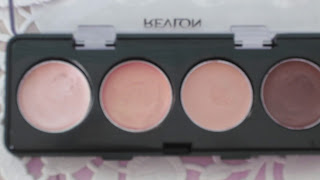
Like every other makeup addict, I heard/read about the Maybelline color tattoos and could not wait to try them for myself. I went to the Maybelline counter and decided to swatch them and try them out....it was love at first swatch! Since then, I have been to more Maybelline counters than I could count and swathed my favorite color tattoos more times than I care to remember. However I just couldn't get myself to buy any of them. I know that sounds weird and I can't even justify not buying them already to myself. Having swatches Bold Gold and Bad To The Bronze, I moved on to the Revlon counter and spotted this little quad of lovely shimmering cream eyeshadows. I swatched them and decided I would try these out and then buy the Maybelline color tattoos the next time. The darkest color in this quad is really similar to Maybelline's Bad To The Bronze and the lightest one is similar to Bold Gold so I thought they would make for a great comparison experiment between Revlon and Maybelline. Now onto the review.
T <3
Apparently this product was released in many variations, each with a different combination of colors but there were only 3 shades available at the store that I bought this one at. The choice was between Copper Coast and Pink Petals. As you can see i chose Pink Petals. I found the shades in the Copper Coast quad to be too commonplace. The shades in the Pink Petals quad are more unique and pigmented.
The product claims to make your eyes appear "luminous" and "bright" and stands true to this claim. The highlighting color is beautiful and adds a dewy shine to the eyes. It also works well as a brow highlighter. The second color is definitely my favorite in this quad. I can't describe it any better than a purple-pinky-gold but its beautiful! I use this as an all-over-lid-color because its so pretty that I want it to stand out. Also, the purple tones complement brown eyes well. The third color was probably intended to be a pretty peachy-pink but unfortunately it just looks the same color as my skin so I think I will use it as a base for my powder eyeshadows. The last color is a dark burgundy-purple. It is a good color for the crease but if you use it as a lid color it may make your eyes look tired so just avoid doing that. Here are some swatches of the 4 colors:
Despite being a cream eyeshadow it creases quite easily. It's such a shame because I really love the shades. They make for a wonderful natural eye look. If you know how to prevent/reduce the creasing, let me know in the comments below. I find that using a primer just reduces the color payoff of these shadows.
Cost: Rs. 540
For this cost, Revlon could have done a better job with the packaging. The packaging looks fragile and cheap and I'm always worried that I might drop the quad and break it.
My Rating:3/5
T <3


great post! would you like to follow eachother?
ReplyDeletexx
daniella
simplybeautifulelegant.blogspot.com
This comment has been removed by the author.
Deletei suggest using a quality eye primer such as Urban decay, wait for a minute then apply ur shadow in a patting/ dabbing style rather than swiping motion.. this using a sponge applicator will give you a great payoff.. i also sometimes use my Mac prep and prime setting powder very lighlty my cream shadow.. hope this helps ya! :)
ReplyDelete